Creating compelling art often hinges on how well you guide the viewer's eye through your composition. Whether you're working with a focal point, employing the Rule of Thirds, or leveraging the Golden Ratio, understanding these principles can elevate your work. Let's examine how these techniques can transform your drawings into captivating visual experiences.
Obvious Focal Point
Creating a drawing with an obvious focal point starts with deciding what you want your audience to notice first. The focal point is the key element that captures attention immediately.
Using a horizon line can help ground your drawing and give it structure. By placing your focal point near the horizon line, you offer a comforting context, even in abstract art.


Perspective plays a crucial role. Imagine a long winding road leading straight to a beautiful, solitary tree. The road guides the viewer's eye straight to that tree, making it the unquestionable star of your piece.
Contrast is another useful tool. Your focal point will stand out if it strongly contrasts with surrounding elements. Whether through color, light and dark, or detail versus simplicity, contrast can make your focal point rise above the rest.
Size and placement also matter. Placing a single eye-catching object in a particular spot can command the viewer's attention. Typically, elements off-center but within the frame's natural line of sight are most effective.
Isolation can also be powerful. An isolated element in a composition draws attention because it stands apart. This can be achieved by leaving ample negative space around the focal point, allowing it to command attention effortlessly.

Rule of Thirds
The Rule of Thirds involves dividing your canvas into nine equal parts with two equally spaced horizontal and vertical lines. The key is to position important elements along these lines or at their intersections.
When you break down your canvas like this, you create guideposts that help you achieve a balanced and compelling image. It's like placing actors strategically on stage—every element has its own space to breathe, but together they form a well-orchestrated performance.
Applications of the Rule of Thirds:
- Landscapes: Place the horizon line along one of the horizontal third lines.
- Portraits: Position the subject's eyes at one of the upper intersections.
- Negative Space: Use it to enhance the primary subject's prominence.
Remember that the Rule of Thirds is a guideline, not a strict law. Sometimes the best compositions come from knowing when to break the rules. Experimenting can lead to refreshing and innovative art.
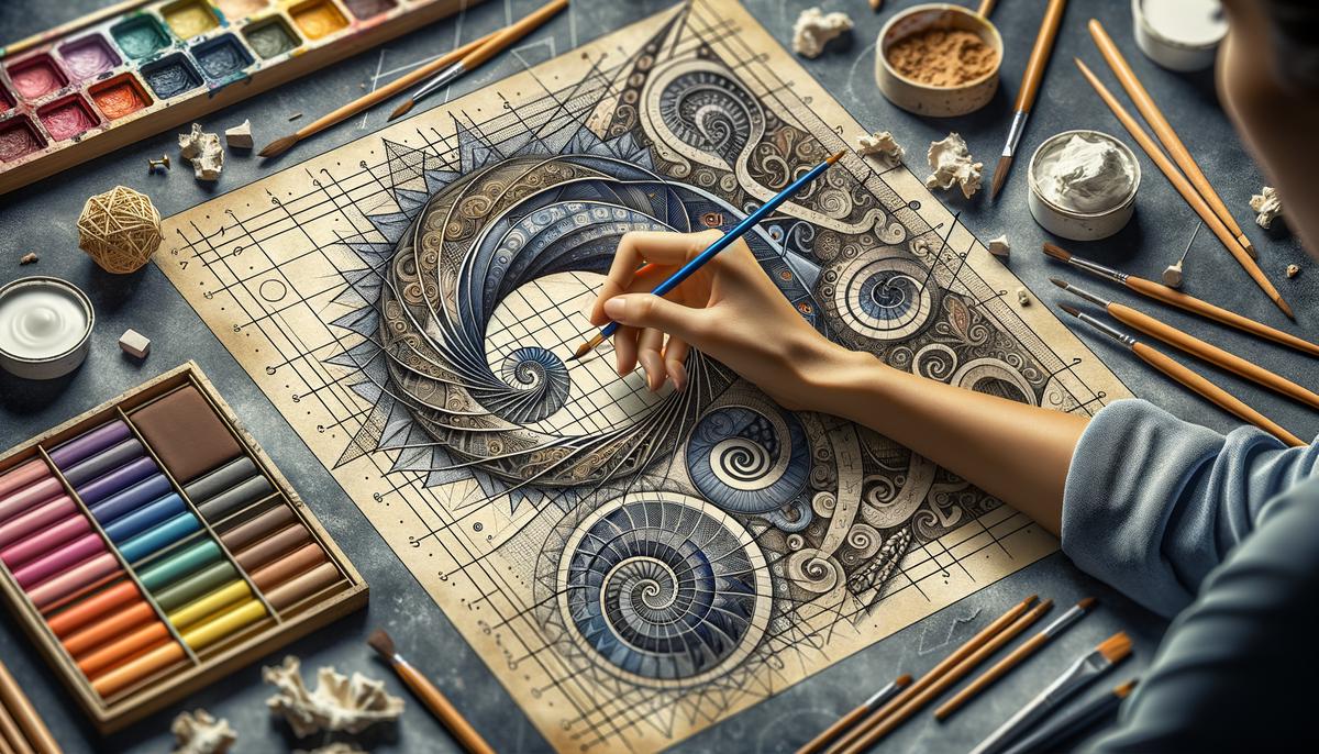
Golden Ratio
The Golden Ratio, approximately 1:1.618, is a mathematical principle that has been used in art for centuries1. By aligning elements along this ratio, you can create compositions that feel naturally balanced and harmonious.
Start by envisioning your canvas with a Golden Rectangle—a rectangle whose side lengths adhere to the Golden Ratio. Within this rectangle lies the potential for an infinite spiral, known as the Fibonacci spiral. This process can be repeated, creating a logarithmic spiral that guides the eye through the artwork in a fluid manner.
"The Golden Ratio offers a blueprint for both simplicity and complexity."
Consider placing your focal point or key elements along the lines and intersections derived from dividing your canvas according to the Golden Ratio. For instance, a portrait where the subject's eyes lie along one of these lines will immediately draw attention and appear more balanced.
However, like with any artistic guideline, the true mastery comes in knowing how and when to bend it. Some of the most striking artworks deviate from the Golden Ratio to introduce tension or asymmetry.
Adopting the Golden Ratio in your process doesn't require mathematical precision in every brushstroke; rather, it's about letting this natural proportion steer your overall layout. With time, the application of this timeless formula can transform your canvas into a harmonious blend of nature and human creativity.
Avoid Tangents
Tangents occur when edges of elements in your composition touch or barely overlap, creating confusion about which element is in front. Avoiding tangents helps to maintain a clean and clear composition.
Strategies to Avoid Tangents:
- Give elements enough breathing room
- Master overlapping techniques
- Utilize negative space effectively
- Consider limb placement in figure drawings
- Differentiate elements with color, texture, and detail
Overlapping is another area ripe for tangents but can be mastered with a bit of finesse. Overlapping elements isn't inherently bad—it's a hallmark of depth—but the edges must clearly indicate which object is on top.
Consider tangents when planning the placement of limbs in a figure drawing. Avoid scenarios where a character's arm aligns exactly with the body's edge or touches another object's boundary. Amend the posture of the figure to break the alignment, ensuring a visual hierarchy that keeps the eye moving around the composition.
Remember, tangents aren't just about physical proximity but about visual dominance too. Differentiate your elements with thoughtful use of color, texture, and detail. A highly detailed subject in a primarily monochromatic background will stand out and reduce the risk of visual ambiguities.
By ensuring your composition is free from tangents, you guide your viewer's eye smoothly through the visual tale you've crafted, allowing every part of your work to speak clearly and cohesively.
Mastering these techniques allows you to create compositions that are not only visually appealing but also engaging. By thoughtfully placing elements and avoiding tangents, you guide your viewer's eye smoothly through your artwork. This approach ensures that every part of your piece communicates clearly and cohesively.
- Livio M. The Golden Ratio: The Story of Phi, the World's Most Astonishing Number. Broadway Books; 2002.


