The Evolution of Color Theory
Pigments have been part of human history for thousands of years. The Egyptians used a palette of six colors—white, black, blue, red, yellow, and green. In the Middle Ages, blue was highly prized.
Isaac Newton's work in the 17th century led to the birth of Color Theory. He created the color wheel with primary colors: red, blue, and yellow. Johann Wolfgang von Goethe later explored how our eyes interact with colors, focusing on human perception and emotions.
The Impressionist era brought new perspectives on color use. Artists like Claude Monet showed that shadows weren't just dull grays but contrasts with complementary hues. Expressionists intensified the emotional journey of color, with groups like The Blue Rider considering colors as expressions of the soul.
Yves Klein took color obsession to new heights, creating his own shade—International Yves Klein Blue. He embodied the philosophy of Suprematism, using color to make the invisible visible.
Throughout history, colors have intrigued scientists, artists, thinkers, and educators. Mary Gartside, for instance, explored colors before Goethe, offering a woman's perspective in a male-dominated field. Her "color blots" are considered precursors to later art movements.
Color theory remains an evolving puzzle, a playground for human perception and emotion that continues to inspire and challenge the art community.
Impact of Art Movements on Color Use
Art movements have dramatically shaped how colors are used and perceived. Impressionists used soft pastels to capture fleeting moments of light, with Monet blending warm oranges and pale blues to depict twilight or sunlit afternoons. They reimagined shadows using vibrant complementary colors rather than gray tones.
Fauvism brought a bold leap in color expression. Artists like Henri Matisse and André Derain used jarring, pure colors in bold strokes. They paired bright greens with violent purples and fiery reds with deep blues, creating an emotional intensity in their work.
Pop Art brought vibrant colors into the mainstream, borrowing from the commercial world's palette. Roy Lichtenstein and Andy Warhol used bright primary colors separated by black lines, reminiscent of comic strips. This style not only celebrated but also critiqued mass media and consumerism.
Each movement's color choices reflect the changing attitudes and cultural climate of their time, inviting viewers to see and feel the world differently.
Color Psychology in Art
Colors in art do more than fill space; they evoke emotions and create atmospheres. Kandinsky saw colors as musical notes, each with a unique emotional tone. To him, deep blue represented infinity and the supernatural.
Expressionists used color to capture human emotions, painting with bold strokes aimed at the psyche. Their vibrant palettes were active participants in storytelling, as impactful as a scream or as tender as a whisper.
Color psychology in art plays on our innate understanding, affecting mood and shifting perceptions. Artists today continue to experiment with this knowledge, weaving personal expression and universal symbolism into their work. They use warm hues to evoke optimism and energy, while cool shades might inspire calmness or contemplation.
In modern design, these lessons from art giants like Kandinsky continue to influence creators. Artists and designers seek to craft experiences through color, exploring which hues will resonate with viewers and leave lasting impressions.

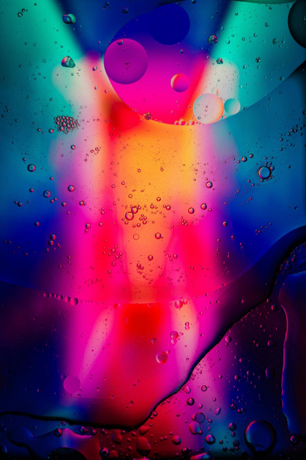
Photo by julianhochgesang on Unsplash
Influence of Technological Advances on Color
Technological advances have revolutionized how artists use and experience color. The invention of synthetic pigments expanded the variety of colors available, liberating artists from the constraints of natural pigments. This development allowed Impressionists like Monet and Renoir to paint outdoors with pre-mixed paints in tubes, brightening their palettes.
The digital era has further transformed color use in art. Software like Adobe Photoshop and Procreate offer infinite color possibilities, allowing artists to blend, smudge, and recolor with ease. Digital tools enable new forms of expression, from virtual reality painting to surreal photo manipulations.
These advancements have also brought the global creative community closer, facilitating collaboration and conversation across boundaries. Artists can now revisit traditional techniques while forging new paths, pushing the boundaries of color theory with each digital brushstroke.
Technology continues to influence how we interpret and integrate color in art, creating a space where tradition meets innovation and every pixel tells a story.
Contemporary Applications of Color Theory
Modern artists and designers apply color theory in innovative ways, creating works that are both aesthetically pleasing and functional. The Solarized color scheme by Ethan Schoonover, for example, offers a balanced digital palette that reduces eye strain, demonstrating how color theory can improve user experience in technology.
In the physical world, artists juxtapose vibrant colors against minimalist designs to create engaging spaces that spark emotion. These applications show how color continues to play a crucial role in composing environments that draw observers in.
Color theory extends into branding strategies as well. Companies use color psychology to connect with consumers, choosing hues that reinforce their values and stories. In this way, color becomes a subtle yet powerful tool in communication between creators and audiences.
Contemporary artists and designers blend artistic expression with practical function, redefining color's role in our daily lives. They use color not just for decoration, but as an integral part of storytelling and user experience, showing that the interplay of hues remains one of art's most enduring and evolving concepts.

Colors have long been a bridge between perception and emotion, serving as a silent yet powerful language in art. They continue to shape our understanding and experiences, inviting us to see beyond the surface into the heart of human expression.
- Newton I. Opticks: A Treatise of the Reflexions, Refractions, Inflections and Colours of Light. London: Royal Society; 1704.
- Goethe JW. Theory of Colours. London: John Murray; 1840.
- Kandinsky W. Concerning the Spiritual in Art. New York: Dover Publications; 1977.
- Loske A. Colour: A Visual History. London: Tate Publishing; 2019.
- Schoonover E. Solarized: Precision colors for machines and people. Ethan Schoonover. 2011.


