Colors shape our perception and influence our emotions in ways we often overlook. From the subtle hues that calm us to the vibrant tones that energize, understanding how colors interact is key to crafting compelling digital art. By grasping the fundamentals of color relationships, artists can create pieces that resonate on a deeper level.
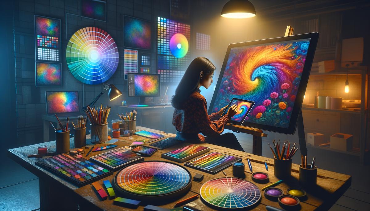
Understanding the Color Wheel
The color wheel is an essential tool for any artist, guiding us through the sea of creative possibilities. At its core are the primary colors: red, yellow, and blue. By mixing these, we create secondary colors: orange, green, and purple. Between these lie the tertiary colors, like red-orange or blue-green, adding depth to our palette.
The color wheel also reveals harmonious relationships:


- Complementary colors, sitting opposite each other, create vibrant contrasts.
- Analogous colors, found side by side, offer a more peaceful harmony.
- The triadic scheme, using three evenly spaced colors, brings balance and diversity.
In digital art, understanding these relationships allows for precise mixing and matching, creating designs that resonate visually and emotionally. It's like tuning instruments in an orchestra – when colors harmonize, the artwork sings.
Color Schemes and Harmonies
Color schemes are the secret ingredients that make digital artwork visually appealing. Let's explore some popular options:
- Monochromatic schemes use variations of a single hue, creating a cohesive look. The challenge is maintaining interest through texture and composition.
- Analogous schemes use colors next to each other on the wheel, evoking unity and subtlety. Think soft pinks merging into gentle reds.
- Complementary schemes pair opposite colors, like orange and blue, for eye-catching contrast. Balance is key to avoid overwhelming the viewer.
- Triadic schemes use three evenly spaced colors, bringing energy and life to bold, dynamic works. The trick is finding balance, often by choosing one dominant color with the others as accents.
In digital art, these schemes aren't just guidelines – they're storytelling tools. They help convey emotions, direct focus, and evoke responses. Understanding and applying these harmonies can unleash powerful visual narratives.

Photo by picoftasty on Unsplash
Color Psychology and Emotional Impact
Colors do more than please the eye – they speak to our emotions and thoughts. Consider these emotional associations:
- Red demands attention, evoking passion and energy.
- Blue wraps us in tranquility, inviting calm.
- Yellow sparkles with happiness, brightening spaces and lifting spirits.
- Purple adds elegance and mystery.
- Green breathes life and renewal.
For digital artists, strategic use of these colors can transform art into storytelling masterpieces. The right choice can evoke nostalgia, joy, melancholy, or excitement without a single word. Understanding this emotional dance allows artists to craft experiences that resonate deeply, making viewers participants in the journey.
Next time you're choosing a palette for your digital creation, consider the whispers of color psychology. Let each hue tell its story, unlocking a dance of emotions that can transform pixels into poignant experiences.

Practical Application of Color Theory
Balancing colors in digital art is like cooking a good meal – you need the right mix of ingredients. Start by choosing a dominant color as your foundation, occupying 60-80% of your composition. This ensures a coherent theme and guides the viewer through your artwork.
Use complementary colors to support your main hue without overshadowing it. Reserve high saturation for focal points, and let lower saturation tones add depth without disruption. Contrast creates drama – try placing darker, cooler colors beside lighter, warmer tones.
Digital tools like Adobe Photoshop or Procreate offer sliders to tweak hue, saturation, and value. These are your digital spice rack, allowing you to fine-tune your artwork. The value slider is particularly useful for guiding the viewer's eye or softening distracting elements.
While rules in art can be bent, understanding these principles means you can break them with intent and flair. Through thoughtful application of color theory, you allow each pixel to contribute to a synchronized dance of color and emotion.

Color in Digital vs. Print Media
Working with color across digital and print media is like speaking two languages with a single translator: color management. Each medium has its quirks, especially when dealing with RGB and CMYK color spaces.
| Digital (RGB) | Print (CMYK) |
|---|---|
| Additive model (light-based) | Subtractive model (ink-based) |
| Red, Green, Blue | Cyan, Magenta, Yellow, Key (black) |
| Ideal for screens | Ideal for physical prints |
In the digital realm, RGB (Red, Green, Blue) reigns supreme. This additive model mixes light to create a full spectrum of colors, perfect for screens from smartphones to TVs.
Print media uses CMYK (Cyan, Magenta, Yellow, Key/black). This subtractive model begins with white and adds ink to create colors, similar to mixing paints.
Each space has strengths – digital art thrives in RGB, offering vibrant depth on screens. Print media needs CMYK to produce accurate, tangible artworks.
Color management is crucial for consistency across mediums. Without it, your carefully curated digital blues might print as murky grays. Knowing when to use RGB or CMYK helps bring your vision to life whether on screens or pages.
In the end, mastering color is about more than just technique; it's about creating connections. By thoughtfully choosing and balancing hues, artists can transform their work into a visual story that speaks to the heart and mind alike.
- Livingstone M. Vision and Art: The Biology of Seeing. Abrams; 2008.
- Gurney J. Color and Light: A Guide for the Realist Painter. Andrews McMeel Publishing; 2010.


