(Skip to bullet points (best for students))

Born: 1945
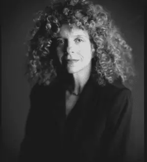
Summary of Barbara Kruger
Barbara Kruger is most known for her silkscreen prints, in which she scribbled a simple text on the surface of a found image. Her prints from the 1980s effectively captured the Reaganomics period with tongue-in-cheek sarcasm, particularly in works like (Untitled) I shop therefore I am (1987), which ironically became the mall generation’s motto. Kruger’s work grew to encompass site-specific installations, video, and audio pieces as her career developed, all while keeping a solid foundation in social, cultural, and political critique.
She has also returned to magazine design during the 1990s, integrating her aggressive words and imagery into a domain apart from the art world. Kruger, who is associated with both postmodern Feminist and Conceptual art, uses appropriation, as well as her trademark humour and forthright criticism, to interact with the spectator and promote the investigation of present conditions.
Kruger’s use of picture and word is economical, allowing for direct connection with the spectator. She synthesises a critique of society, the economics, politics, gender, and culture into a brief definitive statement.
Kruger uses the vocabulary of modern periodicals, graphic design, and magazines to combine the polished façade of graphic design with surprising words in order to capture the viewer’s attention. Rather than aiming to market a product, her art aims to sell a concept to the audience, one that will cause them to reevaluate their current situation.
Kruger takes photographs out of their natural context in publications and uses them as the backdrop for emblazoning aggressive statements. Each detail of the finished artwork, from the readable typeface to the startling palette of red, white, and black, is critical to its efficacy as both an aesthetic statement and a protest against aspects of postmodern existence.
Childhood
Barbara Kruger was born in 1945 in the city of Newark, New Jersey. Her father was a chemical technician and her mother was a legal secretary. Kruger grew up as an only child in Newark, attending Weequahic High School and having a normal middle-class childhood. She was admitted as an undergraduate at Syracuse University, where she took a variety of art and design subjects. Kruger travelled to New York City after only one year at Syracuse to pursue advanced art and design studies at the Parsons School of Design.
Early Life
Kruger’s Parsons professors were Diane Arbus, an American photographer, and Marvin Israel, a graphic designer. When Kruger was dissatisfied with art school, Israel in particular had a profound impact on her, urging her to build a professional portfolio. Kruger had yet to include mass media images, vocabulary, or signs into her work at this point in her education, and instead concentrated on architectural photography, painting, craft, and sexual imagery.
Kruger got employment as a designer and editor with a variety of New York-based journals after graduating from Parsons, including House and Garden, Aperture, and then Mademoiselle, where he rose up the ranks to become head designer within a year of joining at the age of twenty-two. She was driven to pursue a career in art despite her early success in editorial work, stating, “I basically wasn’t cut out for design work because I had difficulty in supplying someone else’s image of perfection.” Kruger’s first big break came in 1973, when Whitney Biennial director Marcia Tucker, who would later create the New Museum of Contemporary Art in New York, chose many of Kruger’s pieces for the show.
Kruger acquired an interest in the written word, particularly poetry, in the late 1970s while living and teaching in Berkeley, California, and began writing and performing her own poems and tales while continuing to paint. The allure of language was too strong, so Kruger gave up painting and returned to her first love of photography and words. This interest led to investigations of physical space and limits, which culminated in her self-published “Pictures/Readings.” in 1978. Photographs of building exteriors were paired by narrative text in the form of a dialogue, dilemma, or dramatic scenario on the other page.
Mid Life
Kruger performed a similar photographic study of hospitals shortly after releasing “Pictures/Readings” but this time the accompanying writing was considerably shorter and more declarative, with words like “Go away” and “Not that.” This image-text pattern in her work would soon develop into phrases that addressed social power dynamics, technology, mortality, violence, and the human condition, frequently in the form of abstract ideas and postulations, such as “The illumination of the physical” and “The comfort construct.” Kruger’s work underwent a significant shift in the late 1970s, when she opted to forsake original photography in favour of discovered pictures.
Kruger’s use of language and imagery became more ambitious in the early 1980s. Kruger would later say that the “ability to determine who we are and who we aren’t.” was the reason for her choice of motif of overlaying pictures and text. Kruger was developing language that addressed themes of feminism, consumerism, desire, and personal autonomy with slogans like “I shop, therefore I am” and “Your body is a battleground,” “People write about the art world of the ’80s as a glitzy time – it just makes my head explode – because it was also a time when issues of criticality came to the fore.” Kruger said of the atmosphere in which she developed her critical works.
In 1991, Kruger transitioned to immersive installations with her self-titled solo exhibition at Mary Boone Gallery in New York, where she covered nearly every inch of the gallery’s interior with text accompanied by images, effectively transforming a white-cube gallery into a red, white, and black “arena of hostility.” Kruger was the first female artist to be signed to the prestigious Mary Boone Gallery, which was best renowned for exhibiting macho, Neo-Expressionist male painters at the time.
Kruger’s oeuvre has grown to encompass large-scale works for museums and public locations all around the world in the last two decades. Picture This (1995), a landscape architectural project for the sculpture park at the North Carolina Museum of Art, was one such example. “I think that art is still a site for resistance … I’m trying to be affective, to suggest changes, and to resist what I feel are the tyrannies of social life on a certain level.” she says of her work.
Kruger has taught at the California Institute of the Arts, the School of the Art Institute of Chicago, the University of California, Berkeley, and the University of California, Los Angeles, among others. She has also contributed critical articles and reviews to The New York Times, Artforum, and The Village Voice, among others. Kruger took part in the 51st Venice Biennale, The Experience of Art, in 2005, which was the first Biennale to be organised by two women. The artist spends time in both New York and Los Angeles.
Famous Art by Barbara Kruger
Untitled (You invest in the divinity of the masterpiece)
1982

Kruger used a section of Michelangelo’s famed Sistine Chapel ceiling fresco, namely the depiction of God’s hand caressing Adam’s at the moment of creation, for this early piece. Kruger addresses the spectator directly with the pronoun “You,” allowing them to impose their own storey on Michelangelo’s masterwork. This piece’s implication of personal responsibility, however abstract, is a recurring topic in Kruger’s work. She claims that we are all entangled in a historical narrative, in this case, that of Western ideology, society, and art, and that as viewers of art, our perceptions of the work’s value or purpose are impacted.
Untitled (Your body is a battleground)
1989

Kruger created this poster for the March for Women’s Lives, a 1989 reproductive rights rally in Washington, D.C. The woman’s face is divided along a vertical axis, revealing the photographic positive and negative sides, indicating a very simplified inner battle of virtue vs evil, using her distinctive red, black, and white palette. Although the work’s political and social connotations are obvious, Kruger accentuates the directness of her message by having her model stare straight ahead through the print, directly addressing the spectator through both her gaze and the phrases splattered over her face.
It’s all about me, I mean you, I mean me
2010

Kruger’s background in magazine graphic design has always influenced her work, even though the nature and setting of her work has changed dramatically. Kruger has recently returned to her origins, with a series of magazine covers utilising her original graphic ideas, such as this W magazine cover featuring Kim Kardashian. The artist’s distinctive usage of the Futura typeface on a red backdrop is splashed over a picture on the cover. The image, however, is not an unidentified discovered image, but a professional shot of a celebrity taken just for this cover.
BULLET POINTED (SUMMARISED)
Best for Students and a Huge Time Saver
- Barbara Kruger is most known for her silkscreen prints, in which she scribbled a simple text on the surface of a found image.
- Her prints from the 1980s effectively captured the Reaganomics period with tongue-in-cheek sarcasm, particularly in works like (Untitled) I shop therefore I am (1987), which ironically became the mall generation’s motto.
- She has also returned to magazine design during the 1990s, integrating her aggressive words and imagery into a domain apart from the art world.
- Kruger, who is associated with both postmodern Feminist and Conceptual art, uses appropriation, as well as her trademark humour and forthright criticism, to interact with the spectator and promote the investigation of present conditions.
- Kruger’s use of picture and word is economical, allowing for direct connection with the spectator.
- She synthesises a critique of society, the economics, politics, gender, and culture into a brief definitive statement.
- Kruger uses the vocabulary of modern periodicals, graphic design, and magazines to combine the polished façade of graphic design with surprising words in order to capture the viewer’s attention.
- Rather than aiming to market a product, her art aims to sell a concept to the audience, one that will cause them to reevaluate their current situation.
- Kruger takes photographs out of their natural context in publications and uses them as the backdrop for emblazoning aggressive statements.
- Each detail of the finished artwork, from the readable typeface to the startling palette of red, white, and black, is critical to its efficacy as both an aesthetic statement and a protest against aspects of postmodern existence.
Information Citations
En.wikipedia.org, https://en.wikipedia.org/.


