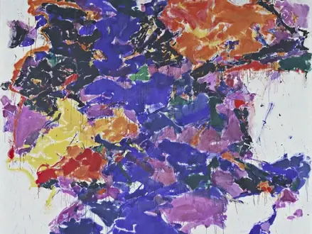
Title of Artwork: “Towards Disappearance II”

Artwork by Sam Francis
Year Created 1957-1958
Summary of Towards Disappearance II
It is a haze of blues, yellows, and reds, as well as their variations in orange and pinks, in Towards Disappearance II There are still hints that Francis used a structure of interlocking cells or globules, close in size and shape, in earlier works; however, more ragged formations and drips suggest a less organised energy.
All About Towards Disappearance II
Primitive colours appear to rise up from below, buoyed up by the weight of black clusters that encircle them in the upper portion of the canvas. Francis became increasingly fond of using white as a contrast in the mid-1950s. Colors only get brighter because the white is pressed into the sides and sparkles in the crevices of the patches of pigment.
Francis had seen exhibitions of Abstract Expressionism while studying painting in California in the late 1940s and had taken in the ideas of the New York School. Pierre Bonnard and Henri Matisse influenced him greatly during his time in Paris in the 1950s, as well as Claude Monet’s Water Lilies series, which inspired him to create his own work.
As a result, Francis is often regarded as the heir apparent to French art’s potent love of colour. Drawing and line aren’t his thing; colour is. As he put it: “Color is the real substance for me, the real underlying thing which drawing and line are not.”
Information Citations
En.wikipedia.org, https://en.wikipedia.org/.


