Labokoff is a beautiful project, created in 2007. It’s about combining photography and watercolour painting together. It was created by an artist from France, named Fabienne Rivory. She explores, how photography and painting interact with each other through the storytelling of imagination, reality, memories, and the real world. Doing so creates abstract pieces that are vastly different from any other I have seen…
Fabienne Rivory was born and lives in France. Many of her photographs were inspired by where she grew up, as her work has a strong link to personal memories, particularly those that evoke childhood memories. She mostly works with the mediums photography, gouaches, and inks. Rivory starts off with a photograph that are I black and white, and then paints onto them, giving an abstract visual appeal.
With the work she creates, she likes to work with photographs that are connected to memories, with minimal landscapes. Most of her imagery are of natural landscapes and close-ups. It shows that her work may have been influenced by close-up and landscape photography. With each of her work she mainly uses one colour only, which has a not only a minimalistic quality, but it makes sure that the imagery stands out more.

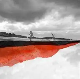
This piece of work is called Aout, and is painted on Hahnemuhle fine art paper, using inks. The aout translates to august, so I’m assuming that the artist may have done this during august time.
I think this piece of work looks interesting, as it tells a story. I believe it tells a story of two boys-brothers, playing, completely unaware that they are the edge of the world. I do like how the artist has chosen to use the colour orange it’s a nice contrast to the image, but it also has a connotation to joy, which is reflected in the boys who are having fun. This may also have a reflection to the artist who has had a happy childhood. I like how the artist has left some texture from the painting rather than leaving it to look flat. This also gives an increased depth to it.

This piece of work is called Pole Turquoise, which has been printed on Hahnemuhle fine art paper, using pigmented inks.
I think this piece of work looks striking as half of it has been painted in a single block of the colour blue. I definitely makes me curious and question as to why the artist has done that.
I believe that this is something that she wanted her audience to do. Shed has also done this with her other work including called Pole Triangle, and Pole Rouge, using the colours red and green. I do like how the artist has chosen the colour blue, as the image is of a bridge, which always go over a river/canal, so this is what the blue may represent.
I like the image she has used because the image is thought-provoking. It helps to tell the story of its setting. Showing of a road over a bridge, engulfed in fog, in the early morning, as a car driving down can be barely seen. The image has been captured using the composition of leading lines, as the eyes may follow the fence and the poles towards the fog in the road.

This piece of work is called Croisees C, which translates to cross.
In my opinion, this piece of work looks beautiful with a peaceful ambience. I like how Rivory, chose to let the paint drip down the paper, as it shows that the artist doesn’t care about something being perfect. I like how the artist is using the colour green to paint on another mountain, which gives a dreamy effect. The green also helps to bring in that calming feeling to the image. Additionally green is associated with wealth, which is seen in the wealth of undisturbed greenery in the landscape image. It almost has a poetic sense to it. The landscape image itself has been captured using the composition rule of thirds, triangular angles inside of it.

This piece of work is from a series called Pole (part 1). It’s called Pole Emeraude, which translates to emerald. I assume that the artist has chosen to name it emerald because this artwork is just full off different shades of green. The name emerald is also associated with the symbol of love. This may reflect that the artist has a lot of love for the place in the image.
In my opinion the piece of work is simple yet nostalgic. It has the effect of nostalgia from the dreamy look of the hills in the background not being super defined. This gives a minimalistic quality to her work. This has a kind of poetic vision to it, that may make the audience to go on a nostalgic memory lane, from its dreamy landscape. The image itself uses the composition of left to right rule.
If you would like to buy any of her works. Here is a link to her Etsy shop.


